Inquiry
Issue on GithubScore
Observations
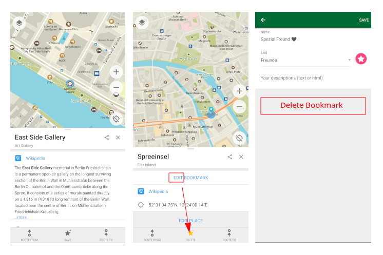
SAVE button changes to a DELETE button which removes a place from Bookmarks.EDIT BOOKMARK button resembles the EDIT PLACE button instead of the prior location where a user interacts with a Bookmark (the bottom bar).ADD / EDIT PLACESuggestions
DELETE Bookmark button instead to EDITImages
Inquiry
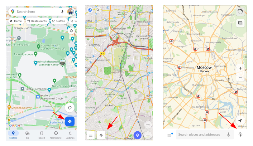
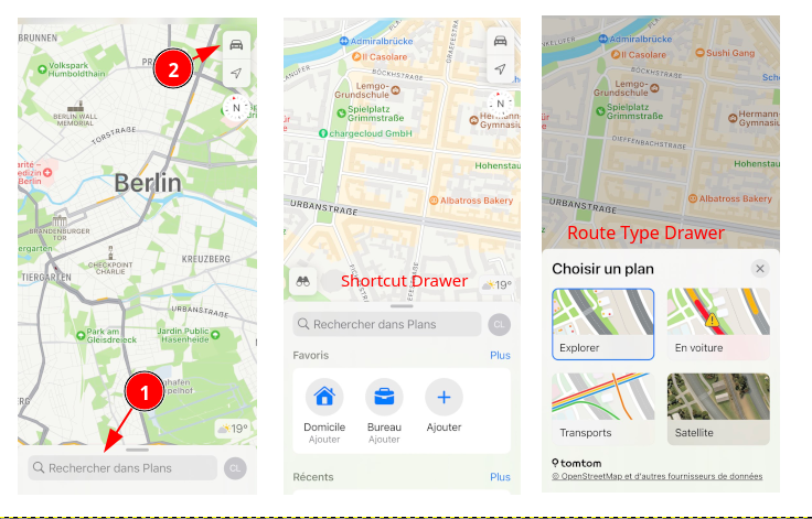
As is being discussed in #5673 one thing I’ve discovered in my analysis that is missing from other map apps is a Directions button which triggers some part of Route building user flow.
Looking at Google Maps, OsmAnd, and Yandex, all feature a Directions button
Upon clicking this button it triggers an interaction that directly leads to UI component as described in #5697
iOS Maps diverges from this and appears to be what OMaps has been most closely modeled after.
iOS Maps manages to achieve a high degree of usability by relying on drawer or slide panel as I call them.
OMaps already has these drawer style panels for Place information./
Score
Suggestions
Directions button to UI. Clicking this button could trigger one of multiple interactions:Images
Inquiry
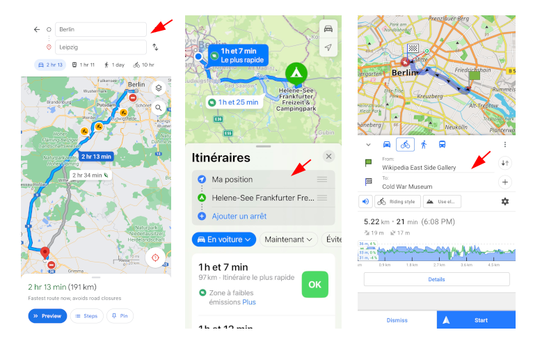
In almost every map app there is a UI component “drawer” style or full screen view where the user clearly sees two editable text fields clearly displaying a starting point and destination, e.g.
From: Address 123, Manhattan
To: Other Address 456, Brooklyn
In OMaps this UI component does not exist or it is extremely difficult to discover. The Routing implementation in OMaps is most similar to that in iOS Maps in terms of UX flow, but deviates in some ways which will be discussed in multiple issues. This issue is to propose / track the idea of this specific UI component.
The current implementation is functional, more so once a user has used it multiple times.
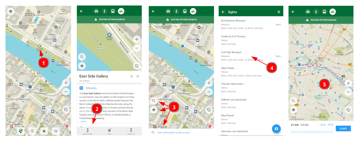
At no point in this flow does the user see text representations of both the start and destination points except as an intermediary selection item.
The missing UI component may be crucial reason which causes the sense of feeling lost and unclear on what interaction a user is doing or the state of the route action.
Issue on GithubScore
Suggestions
Step 2 on Step 3 and both selected places on Step 5 just not editableImages
Inquiry
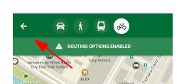
The only clear deliberate way to exit or cancel a route that is being built is
the back button ⭠ in the top left.
This is a common UI element also used in Google Maps. However, in OMaps implementation, it does not go back to previous stage of “route building” or selected Place.
Issue on GithubScore
Observations
Suggestions
Images
Inquiry
Issue on GithubScore
Observations
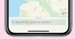
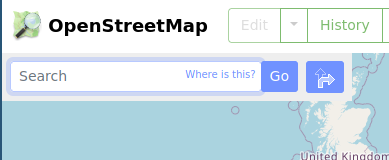
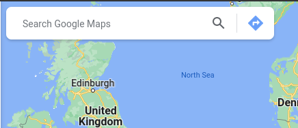
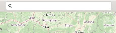
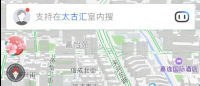
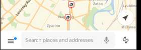
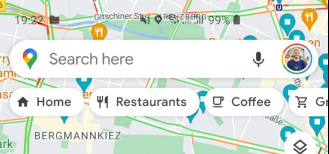
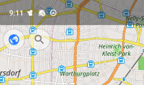
Search
The exception seems to be OsmAnd~ and Organic Maps that show only a Search icon.Suggestions
Search places and make this field span full screen.
Tapping this field takes user to current Search viewImages
Inquiry
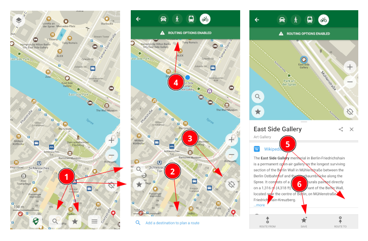
When interacting with Places while building a Route, the buttons and their placement are not ideal, and in some ways problematic.
- The
SearchandBookmarksbuttons are suddenly located on left of screen instead of the bottom. - The icons are not part of a UI component (they float over the map like on the Home screen), it is unclear they are “connected” to the Route building process.
- The user subconsciously questions: why did they move? Do they have a different behavior now?
Score
Suggestions
Search and Bookmarks icons on the bottom of screenImages
Inquiry
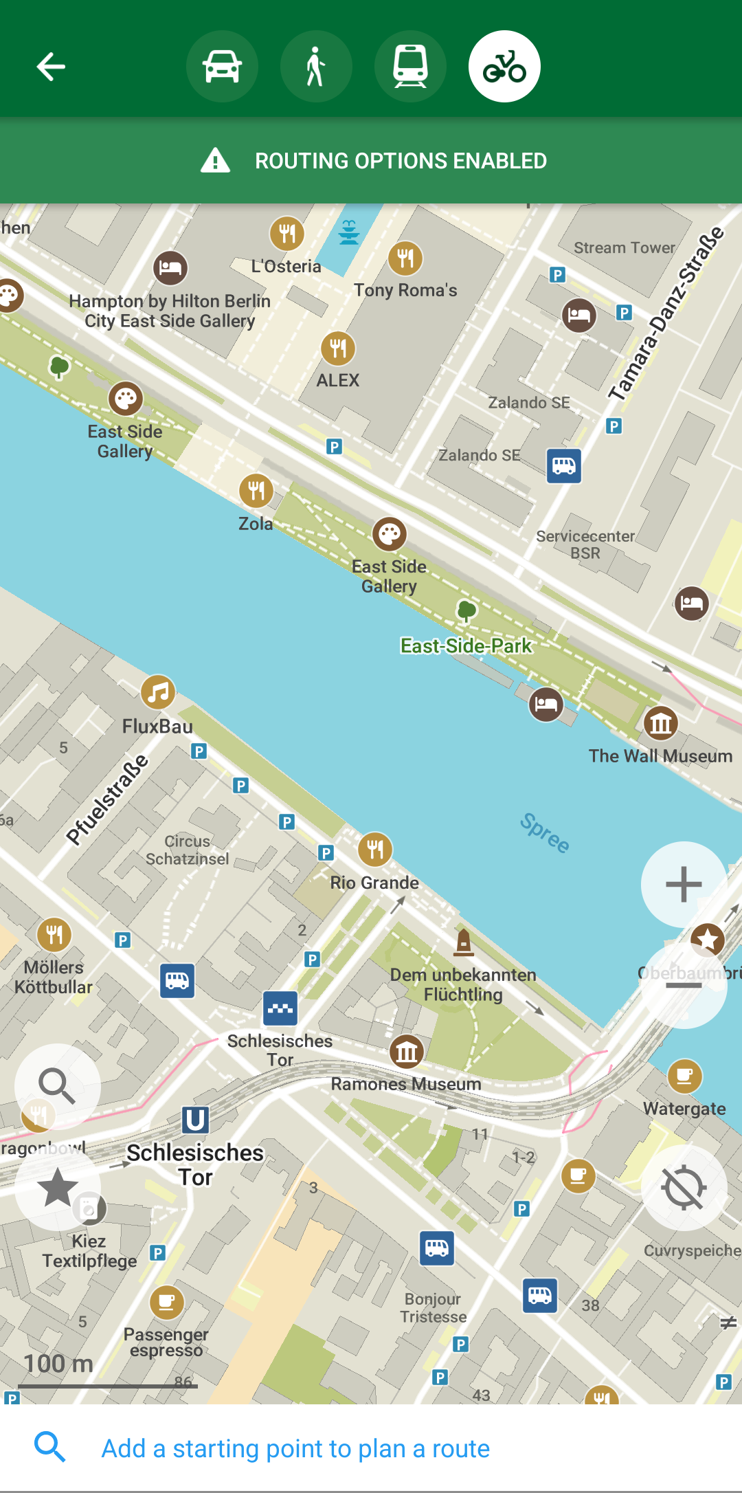
When interacting with Places while building a Route, the buttons and their placement are not ideal, and in some ways problematic.
- The
Add a destination to...bar is subtle and too small font-size - Not obviously a button like others
- Repeats the functionality of the
Searchicon on the side
Score
Suggestions
Images
Inquiry
When interacting with Places while building a Route, the buttons and their placement are not ideal, and in some ways problematic.
- Similar to Observation 1, the
Locatebutton is not visually grouped with the action of Route building
Score
Suggestions
Images
Inquiry
When interacting with Places while building a Route, the buttons and their placement are not ideal, and in some ways problematic.
- The
Routing Optionsat top are separated from the parts of the interaction - The dark green topbar is the dominant UI component on the screen, thus grabs users attention most
Score
Suggestions
Images
Inquiry
When interacting with Places while building a Route, the buttons and their placement are not ideal, and in some ways problematic.
- After Place 1 is selected and then Place 2 is selected by manually tapping on the map, the
Route from / tobuttons look identical. - This does not communicate state of which location has been previously selected by the user or what stage you are in Route building process.
Score
Suggestions
Images
Inquiry
When interacting with Places while building a Route, the buttons and their placement are not ideal, and in some ways problematic.
- The
Savebutton makes no sense to be displayed here, it is a distraction from the purpose ofBuilding a Route
Score
Suggestions
Save buttonImages
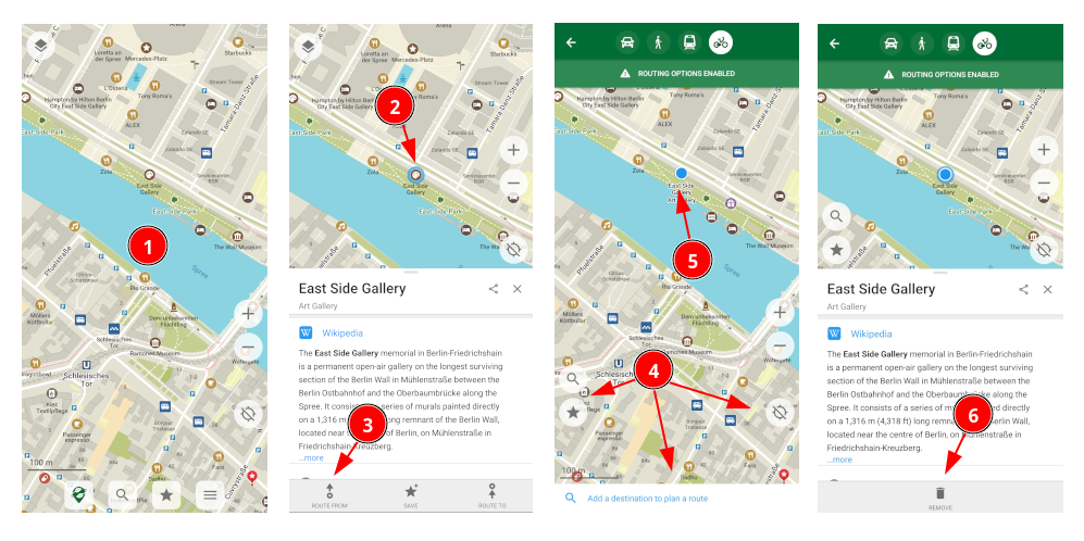
Inquiry
Issue on GithubScore
Observations
Action 5 instead of Action 4 options, a Remove button is shown. This is vague and detached in meaning.Remove button in Action 6 is clicked, elements like green topbar with Routing Options and the white bottom bar Add a... persist, but the route being built is cleared.Point 2) except for the subtle blue text word change from Destination to Start but in reality a user is back at the first view of the flow.Suggestions
Remove buttonImages
Inquiry
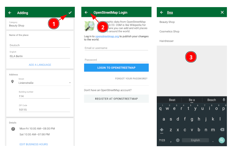
While attempting to add a Place when clicking the back button ⭠ the user is taken to an incorrect state.
The following triggers the bad state.
- Select a point on map
- Open drawer and click
Add Business - Select appropriate category
- Fill out fields of data for Place / Business
- Click the confirm checkmark
✓in top right (Red Circle 1)
The ✓ communicates to user that they should confirm saving the data they just input. It is unclear (to me) if the Place data has been saved somewhere, or if clicking ✓ saves state.
Upon clicking ✓ the user is taken to Login to Open Street Maps webview.
- At the Open Street Map login, click the back
⭠button (Red Circle 2) - User is taken to
Categories Searchview from Step3.
The categories search field is a bad state. It is confusing to user where they are. If the user clicks on the appropriate category, the input fields are partially incomplete from data they just entered.
Issue on GithubScore
Suggestions
✓ button in Step 5. should not take the user directly to OSM login screen. The button should take the user back to the map view with the newly added Place selected. Conribute Place to OSM [Off / On] Off on each new Place unless it is editable in a global setting. Upon toggling to On if a user is logged into OSM, then nothing unusual happens, the data is sent. If a user is not logged into OSM, then it should pop-up the OSM login screen at that moment.Images
Inquiry
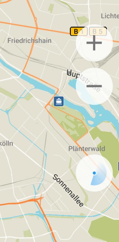
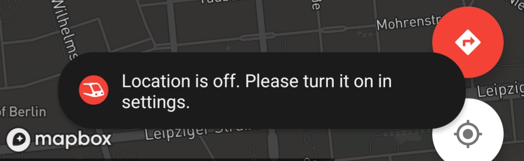
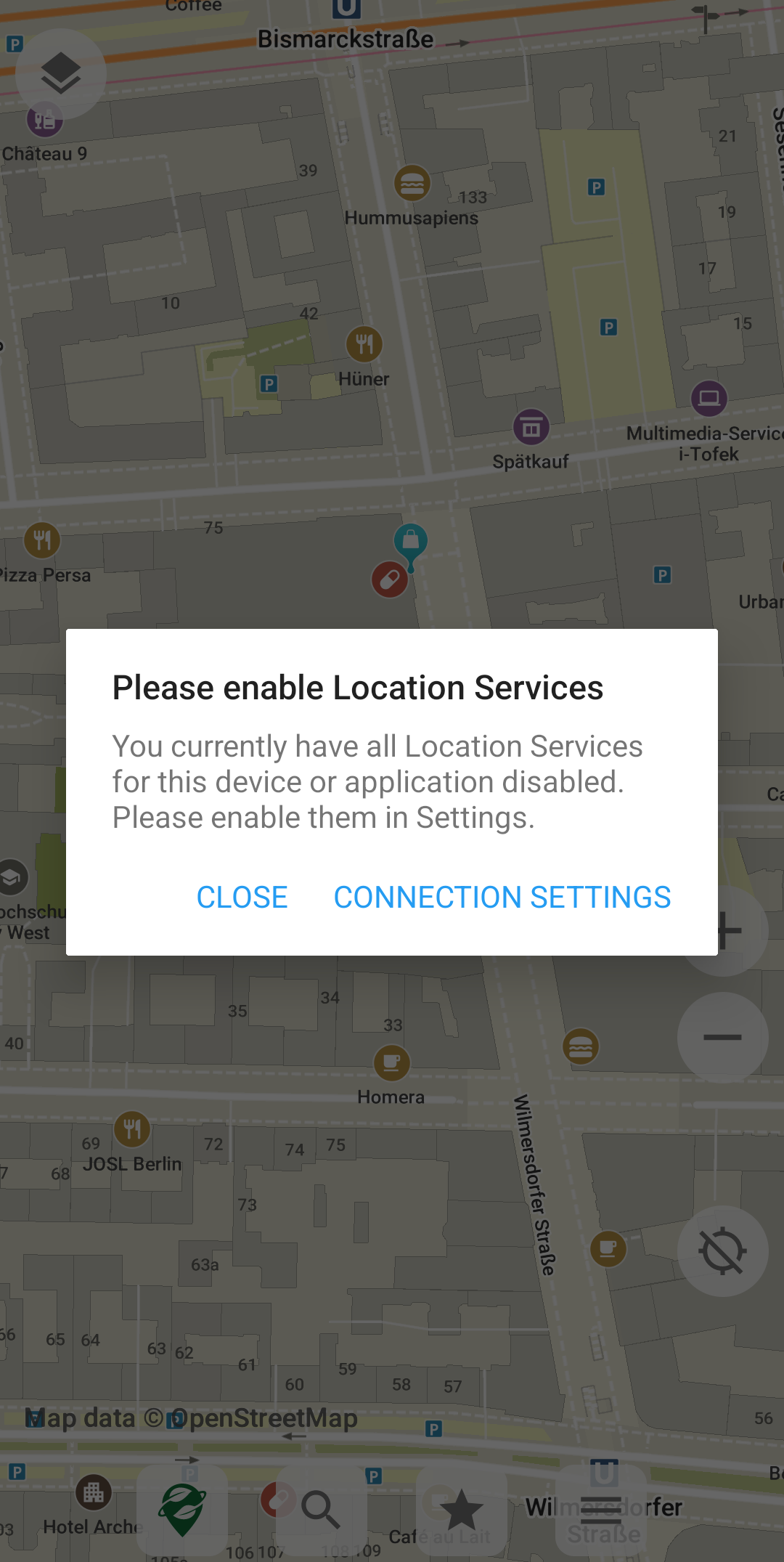
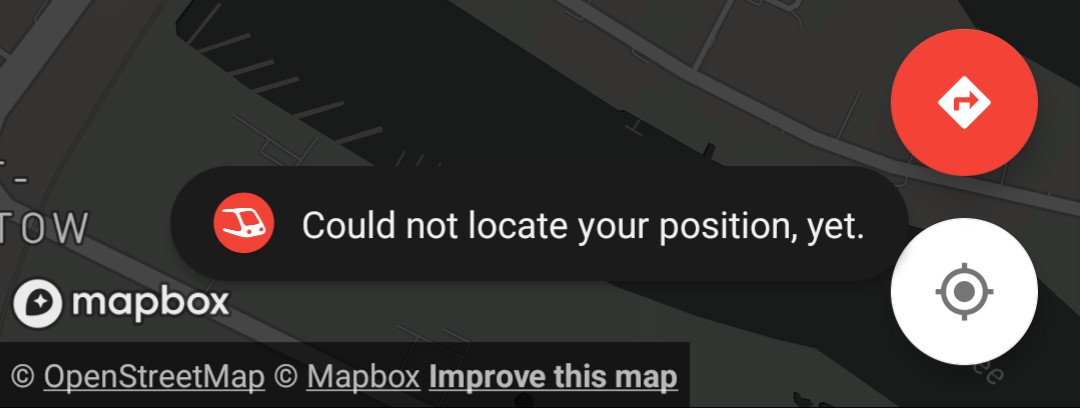
Clicking the Locate icon button, OMaps fails to determine location of user.
This problem is acute and makes OMaps routing highly unreliable and/or entirely unsuable.
Related issue #3450
In Android Location permission settings, OMaps has the same state granted as other map apps:
Allow only while using the app [Y]
- Use device with Calyx, Lingeage, or Graphene OS without Google Services
- Place phone in airplane mode. Disable Location access.
- Click the
Locateicon button - The
Locatingradar icon starts spinning.
After multiple minutes in the Locating state, a pop-up asks Continue detecting your location?
This icon spinning state and failure persists through the following:
- Turning off Airplane mode
- Enabling device Location
- Quitting app
- Force stopping app
- Toggling
Disable / Enableapp
After all attempts at changing the phones state, Organic Maps fails to resolve any result or activate.
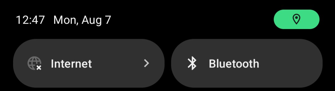
In none of the above states, does OMaps trigger the Accessing Location green icon in the phone’s topbar, which other mapping apps with the same permissions and user conditions do.
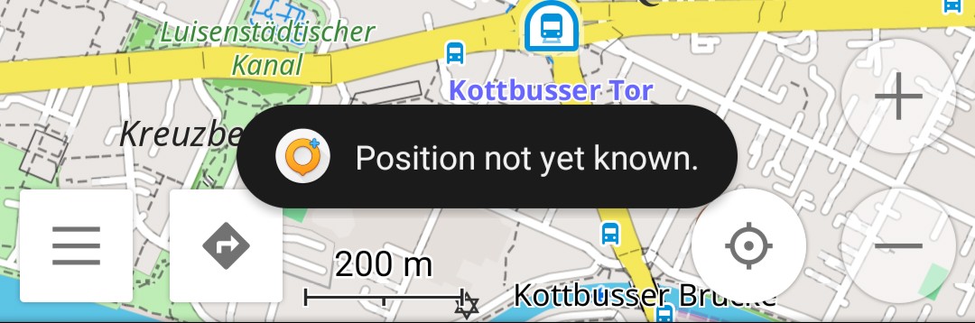
OsmAnd~ and Transportr both work fine and trigger the GPS Locating UI widget of the OS, and properly show me on a map after updating the GPS data. Once this has occurred Organic Maps can also locate me successfully.
Score
Suggestions
Settings -> LocationImages
Inquiry
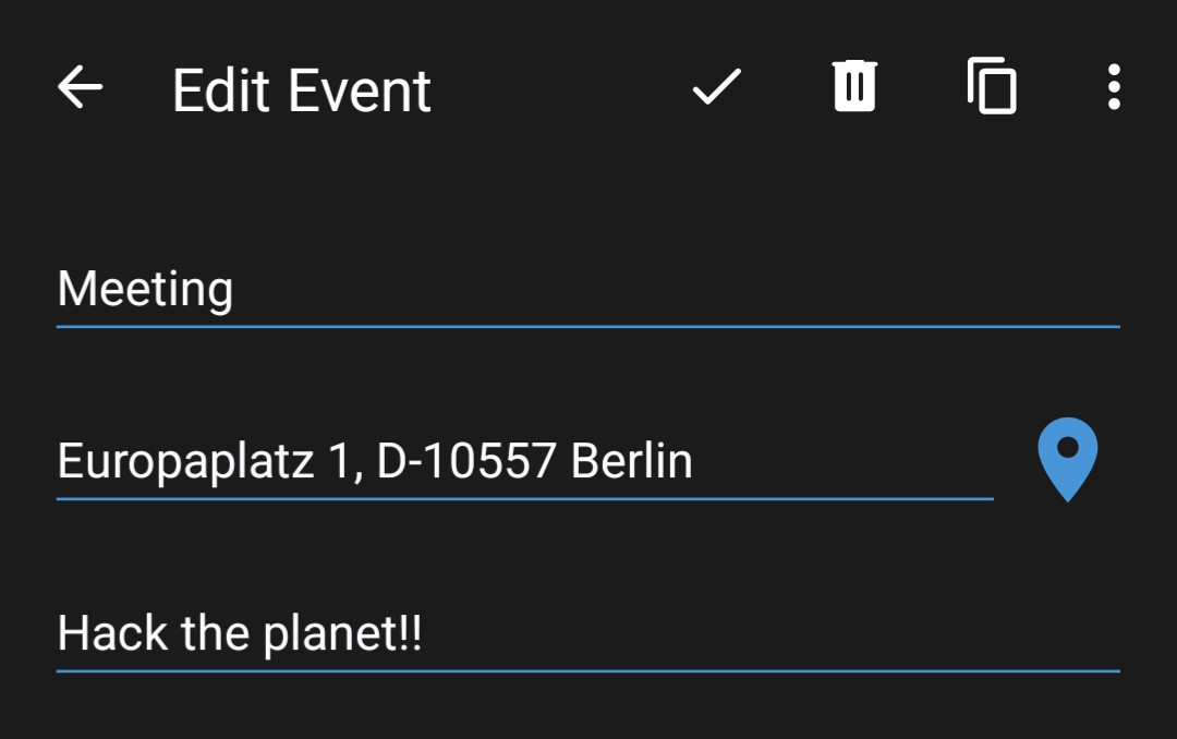
Please write here a clear and concise description of what the bug/issue is about. When clicking on an address in third-party app (Contacts or Calendar) and trying to load a Point of Interest in OMaps it fails to do anything.
Steps to reproduce
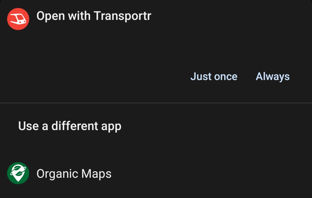
- Click on an address in third-party app (Calendar) and select OMaps
- When another map enabled app is installed, and Android prompts user to choose, the result is the same.
- OMaps opens, but does not center or seem to perform any look up on the map.
Upon further investigation, it seems the issue is when accessing from a third-party app the address is in string format Europlatz 1, 10557 Berlin
In this case OMaps fails to do anything, when loading OMaps with a geo-coord 52.517355, 13.38998 it works perfectly as expected and loads the POI.
Score
Suggestions
Organic Maps could not locate the place: Europlatz 1, 10557 BerlinImages
Inquiry
Finding specific groups of Places (Categories or Bookmarks) relevant to them is a crucial feature of mapping apps. Google Maps implemented a clever shortcut bubble on the Home screen!
However, Categories which are important vary amongst user types and their daily activities. Consider the following:
- Gas & Parking are useless to a city user with no car
- Transport is useless to a user driving across countryside
- Hotels are not needed by most users most of their lives
- Users often look for specific food (Italian, Vegan, Cafes…)
- Quickly find multiple places relevant to that user
This also doesn’t take into account non-public places such as:
- Friend’s houses
- Romantic date spots
- Spot with an epic view
- Buried treasure / microfilm dead-drop
Related: #2520 #4233
Issue on GithubScore
Observations
Suggestions
Categories or Bookmarks with 1 tap from loading the app.Images
Inquiry
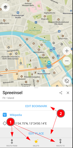
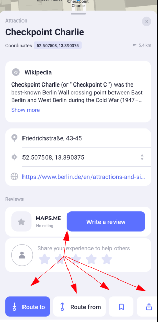
Currently the buttons when interacting with a place have two distinct visual styles and this is disorienting to users.
Issue on GithubScore
Observations
ROUTE... and SAVE and DELETE buttons have icons and are in the bottom barEDIT BOOKMARK and EDIT PLACE and ADD BUSINESS are part of the Place drawer and have no icon. The EDIT BOOKMARK varies with background color as well. Given each button occupies full width of the screen, the buttons take more vertical space that they need too.Suggestions
ROUTE... bottom bar in Style 1. with logical icons included.Images
Inquiry
To serve the goal of making it easier to contribute OSM content as per #5686
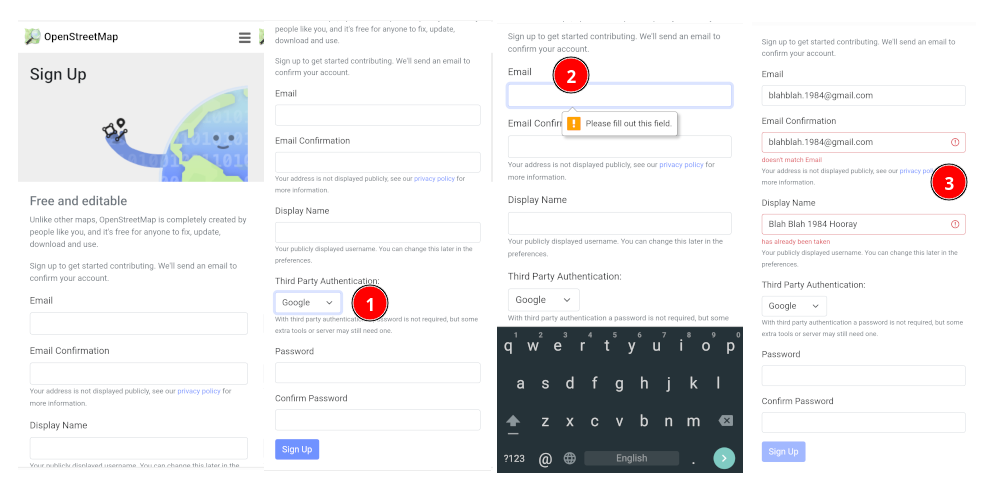
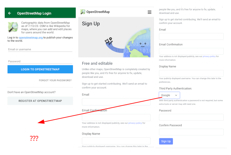
The current user registration form of OSM has multiple UX issues. It breaks most UX principles for easy signup. There are some UX issues with OSMs Third Party Authentication
- Select Third Party Authentication provider
- Discover it still requires an email address, unique display name, and the only benefit is not requiring a manually entered password.
- OSMs form validation when attempting Third Party Auth is very bad
This negates most of the benefits of third-party auth altogether. This is obviously not OMaps issue, but rather OSM side of things.
However, this impacts curious OMaps users who may want to try contributing data to OSM unless they complete the standard form, as cumbersome as it is
Relates to privacy concerns in #5727 and being able to toggle submission ability per Place.
Issue on GithubScore
Suggestions
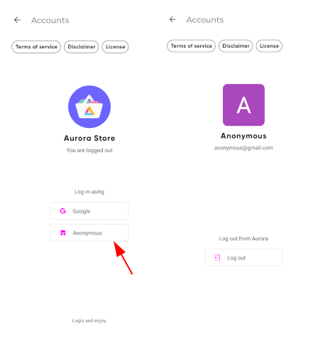
POST style action compared to Aurora’s GET requests, this does pose some ethical threat vectors to consider.Images
Inquiry
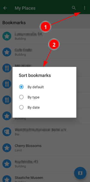
The Categories list is sorted by an algorithm that is unclearly optimized.
- Is it category with most Place listings?
- Most commonly used? Impossible!
- By what type of user (see: #issue- )?
Expected behavior
A user should be able to look at a medium length list like Categories and make sense how to quickly find the item they want (e.g. quickly scroll to bottom or middle) without reading all category names.
Related #3475
Issue on GithubScore
Suggestions
Sort button that allows user to sort by different values (Popular, Alphabetical, Nearby)priority flag to place categories (common to that user) at top of the list.... style menu as on Bookmarks view.Images
Inquiry
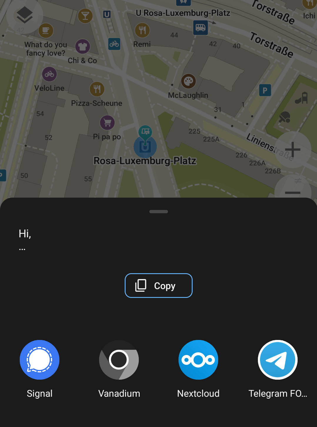
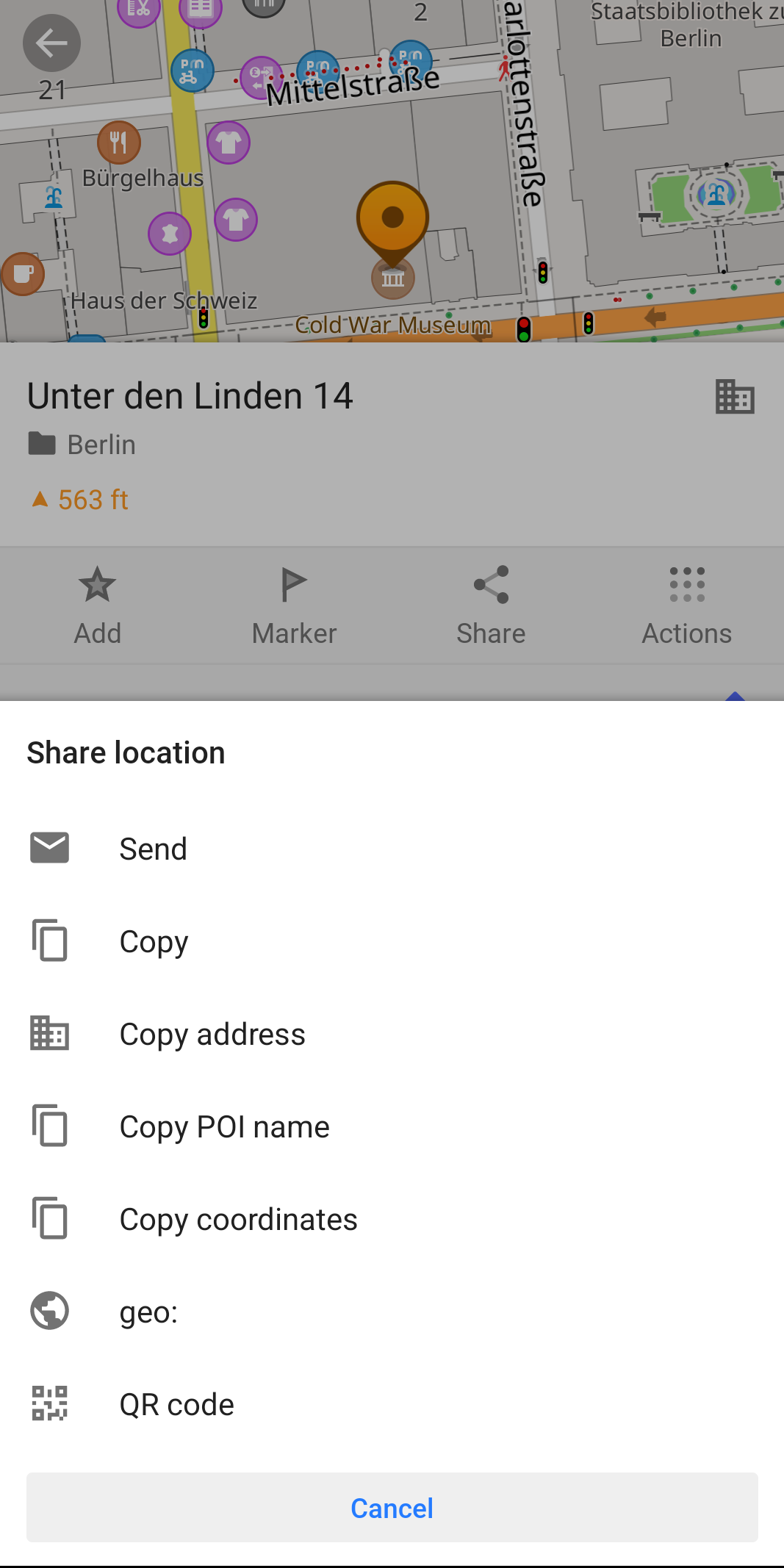
When clicking the “Share” icon in OMaps, the text containing a Place (POI) is undesirable.
- Select any Place and then tap on the share icon which shows the following:
- The user sees the text
Hi, ...which is unclear as to what is being shared.
Showing a more useful sharable message such as:
Unter den Linden, 14, 10127

Open place in an app
geo:52.51745,13.38980?z=17

See place on a webpage:
https://omaps.app/s4MnKE0BOq/Cold_War_Museum
Score
Suggestions
Hi... I am here which might not be true or contextually relevantom:// for better interoperabilityImages
Inquiry
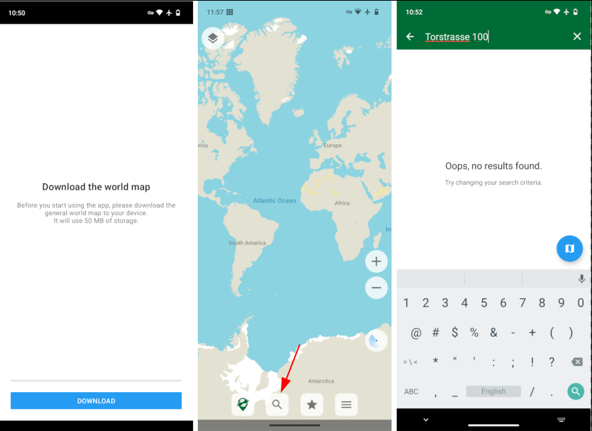
On first install and use of app, after downloading the World Map, OMaps should be more helpful walking users through features and further setup.
- It is not obvious one must download a more local map to search anything
- The
No address foundwhen no maps installed is unclear why
Related issues #1677 #3450
Issue on GithubScore
Suggestions
No address foundyou must download map for this areaImages
Inquiry
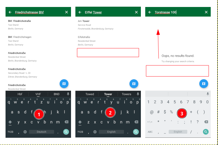
As mentioned in #5785 when search results are lacking, the application could view this as an opportunity to tell users about OpenStreetMaps data.
Issue on GithubScore
Images
Inquiry
@biodranik I am forking this from #5746 due to your response. You communicated to me on our call last week, as well as your first email to me:
The #1 UX issue we would love to solve is how to educate users about OpenStreetMap.org
If this is a real goal, then having OSM hidden away in Settings and only after adding a Place, I’m afraid you will not change the status quo of users engagement with contributing to OSM.
Observations
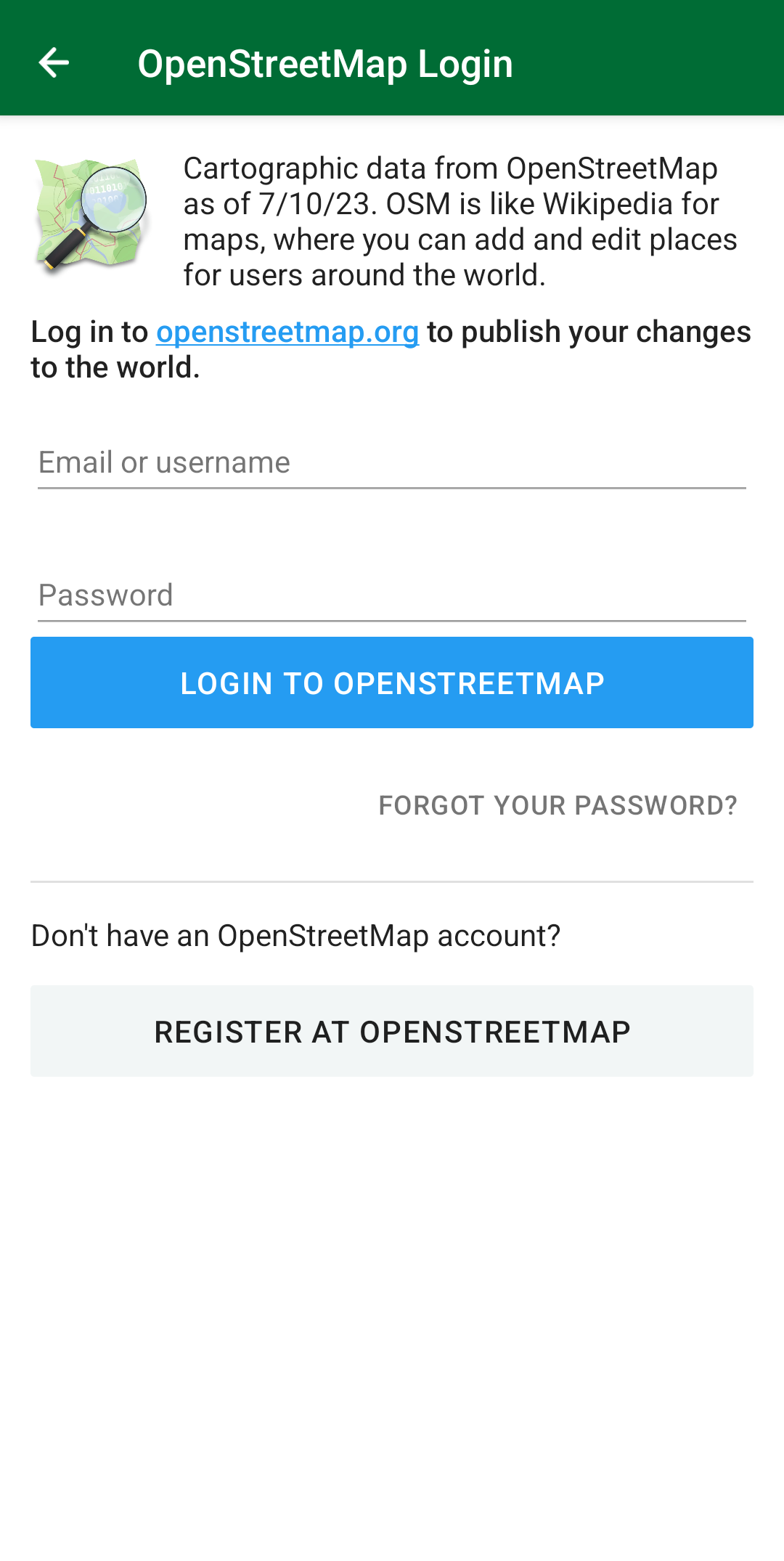
The current OpenStreetMap Login is this:
- One small paragraph of text is not very exciting or engaging for users
- View crams too much into one screen (information, login, and signup)
Score
Suggestions
Get started buttonN Days of use which can be ignored permanentlyImages
Inquiry
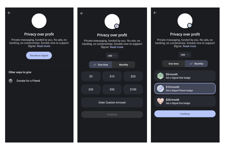
One way to drive more donations to a community supported project like Organic Maps is to reduce friction and make it as easy as possible to donate. A good example of this is this in-app flow in the Signal messaging app.
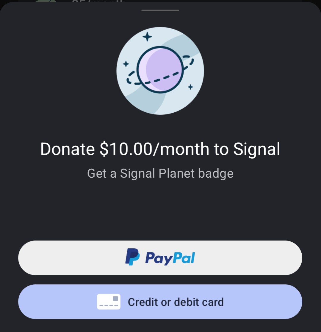
After clicking continue- a bottom drawer pops-up and Signal offers users the option to donate via PayPal or a credit card payment as methods.
One subtle UX “nudge” with Signal’s in-app donation is they tack-on a little badge on the avatar so users can see who is a supportive user who did. This will not work for OMaps as the app itself offers no social graph like Signal. Perhaps there is some area to explore with a partnership OSM which could be leveraged here. Tangentially related to #5740
Crypto Currency
On the web Signal does accept cryptocurrency donations, which are handled by a third-party.
Given that OMaps appears to self-custody their crypto donations, perhaps building this into the in-app flow would be nice.
Issue on GithubScore
Images